

Digital Equity Research Center
The Center’s team requested a participatory design process that aligned with the principles of Design Justice, so I facilitated a process that more closely resembled my approach to community muraling. Our initial workshop clarified how we wanted to present the Center’s core values, what was already working, and what needed some help. The team identified the tone that the identity should strike and how it should be perceived by community members as well as outside audiences. The new identity is accessible, inviting, trustworthy and dynamic, to be expanded upon for years to come.

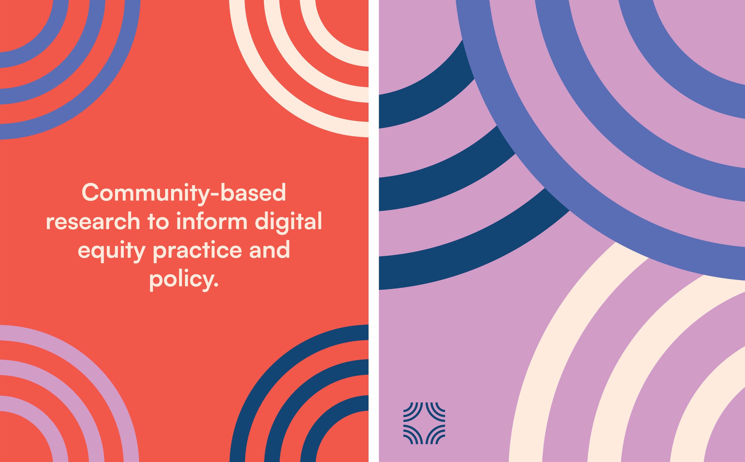
Our final logo references expanding community access to internet and technology. The four corners of the logomark represent the Digital Equity Research Center’s key values: Asset Based, Power Aware, Respect Focused and Justice Centered. The color palette mixes cool blues (representing technology) with warm red and purple (representing equity and community building).


We began the process by collectively envisioning the future identity of the center; how to center their values, and communicate effectively to their various audiences.